
.png)
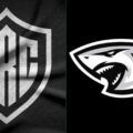
Thirty years after Brian van Zyl and the Natal Rugby Union had the courage to transform Natal into the Sharks, the Durban franchise has done it again. The club has officially rebranded ahead of the 2026/27 United Rugby Championship season, introducing two new logos and a new formal name — Sharks Rugby Club — in what the organisation describes as a deliberate statement of long-term ambition rather than change for change's sake.
New Badge Design Marks Rebranding
The most visible shift is in the badge. Where the old logo featured a shark carrying a rugby ball, the redesigned identity uses the letters SRC alongside a sleeker, reimagined shark icon. Two versions of the logo will be used going forward, giving the club flexibility across commercial and on-field applications. The black and white colour scheme remains intact — the one non-negotiable thread connecting three decades of history to whatever comes next.
Chief executive Shaun Bryans was direct about the reasoning. "Innovation has always been part of who we are," he said. "In 1996, this club had the courage to redefine itself as the Sharks and helped shape the modern era of South African rugby. This evolution is not a departure from that tradition; it is its continuation." He added that the decision reflects a long-term view of where the club needs to be — on the field, commercially and culturally — and pointed to the alignment throughout the organisation under JP Pietersen's coaching structures as proof that the shared vision is real.
Club DNA Remains Unchanged
Controlling owner Marco Masotti reinforced the same message, stating plainly that the badge is evolving but the DNA is not. That sentiment echoes the official club statement, which described the rebrand as "a bold expression of the same identity that has defined the Sharks for three decades, designed to carry the club confidently into its next era."